Untangling Cisco's Commerce Web
Cisco's partner commerce experience had sprawled for decades. Fixing it meant first convincing everyone to stop fixing individual pieces and look at the whole thing.
Role
UX Architect & Strategist
Personas researched
5 partner segments
Goal
1 unified platform
Team
Lead + 4 UX Designers
The Problem Wasn't What Anyone Thought
On the surface, the complaints were familiar: hard-to-navigate apps, inconsistent interfaces, missing data. Tactical stuff. The team before me had been chasing these issues one by one, patching, iterating, moving on.
But underneath those symptoms was something structural. Cisco's commerce ecosystem had grown organically across business units, each operating in its own silo. Partners weren't just navigating bad UX. They were navigating an entire system that had never been designed as a system.
The real problem: no one had ever looked at the whole picture at once.
Five core pain points kept surfacing, and each one was a symptom of the same underlying cause: the absence of a system.
- Navigability: Partners couldn't find what they needed across any of the apps
- Cross-platform disconnects: Each tool had its own logic, its own data, its own experience
- Communication gaps: Information silos blocked partners from doing their jobs
- Scattered metrics: Data existed everywhere, accessible nowhere
- Overcomplicated processes: Workflows built on workflows built on workarounds
The quote entry form captures the problem in miniature. Every field was a manual task. Every step was a friction point. Partners who used this daily weren't inefficient. They were working around a system that had never been designed with them in mind.
Step One: Stop. Look Around.
The first thing I did was ask for permission to pause. That's not a small ask on a high-pressure enterprise project. But I knew that accelerating in the wrong direction would only compound the problem. I needed the team to step back with me: to stop treating symptoms and start diagnosing the disease.
User research sessions with Cisco partners uncovered not just pain points but role complexity: how partners differ by tier, business size, and workflow. One critical insight stood out. Partners aren't just buyers. Their most intense involvement comes after the sale, in renewals, upsells, and long-term account management. Any redesign that ignored the post-sales experience would fail the people who mattered most.
SME sessions with domain experts surfaced the critical failure points inside current applications and business processes. The kind of institutional knowledge that never makes it into a ticket or a bug report.
Before writing a line of design rationale, I created a Future Commerce Kickoff Guide: a shared document that aligned the core team, named the pain points explicitly, and established a common language for what we were trying to solve. This artifact turned fragmented opinions into a shared problem statement.
The Moment Everything Changed
Armed with research, I did something the project hadn't done before: I mapped the entire Cisco commerce ecosystem in one artifact.
Not a journey map. Not a feature list. A systems diagram showing every business unit, every tool, every handoff, every dependency. The full picture, in one place, for the first time.
I presented it to the executive stakeholders. The room went quiet.
“This was the missing piece. Thank you for highlighting how we work in silos and showing the entire picture.”
SVP, Customer and Partner Experiences
That diagram didn't just inform the project. It unlocked it. Executives who had been operating from their respective corners of the org finally saw how their piece connected to everyone else's. It created the alignment we needed to move forward, and it led directly to the full partner journey mapping exercise that followed.
From Insights to Principles
From this comprehensive view of the partner journey, the team distilled a set of Design Principles that would guide every decision forward. These were not generic values posted on a wall. They were direct translations of what partners told us, specific enough to resolve disagreements and broad enough to apply across an entire platform.
Experience Architecture and Information Architecture
One of the most technically demanding parts of this project was designing an experience architecture that could work across all offers, not just the ones we were designing for today. Cisco's offer catalog is vast and variable. A framework tied to any specific offer structure would become obsolete the moment the catalog changed.
So I designed an offer-agnostic framework: a flexible architectural layer that accommodated different offer types, complexities, and customizations without requiring a redesign every time something new was introduced.
To appreciate why an offer-agnostic approach was the only viable path, you need to see the full scope of Cisco's product families and business units. Designing around any one piece of this would have been designing for a fraction of the reality.
When Cisco's executive team decided to integrate the new commerce experience into PX Cloud, I orchestrated card sorting and tree testing with real partners to validate navigation and findability before anything was built. The result was a modular IA designed to scale without collapsing under its own weight.
Underpinning all of this was the end-to-end commerce journey map: every step of the partner experience broken into distinct phases, every touchpoint (digital and human) identified, every application in play traced, and the workflows and dependencies beneath them made visible. This became one of the most referenced artifacts in the project, revealing the “moments of truth” where the experience could either delight or destroy trust.
Designing for Real Partners, Not Personas
Prototypes are only as good as the feedback they generate. So instead of testing in a controlled lab, I took our Figma prototypes into the field, presenting demos face-to-face at Cisco's annual conference and capturing feedback from partners in the moments when they were already thinking about their business.
The full prototype covered both Tier 1 and Tier 2 partner flows across the complete commerce journey. The breadth of scope required constant prioritization to keep the design coherent and grounded.
By the time we had a refined prototype, our partners felt ownership over it. They'd shaped it. That kind of buy-in is invaluable when it's time to launch.
Closing the Gap Between Design and Code
Beautiful prototypes mean nothing if they can't be built. I make technical feasibility a first-class concern, not an afterthought. I worked directly with technical architects and developers to map every UI component to its corresponding back-end data entity, and to identify where front-end and back-end logic diverged.
The outcome was a Postman-based technical proof of concept that bridged the design and development worlds. Developers knew exactly what they were building. Executives could see something real.
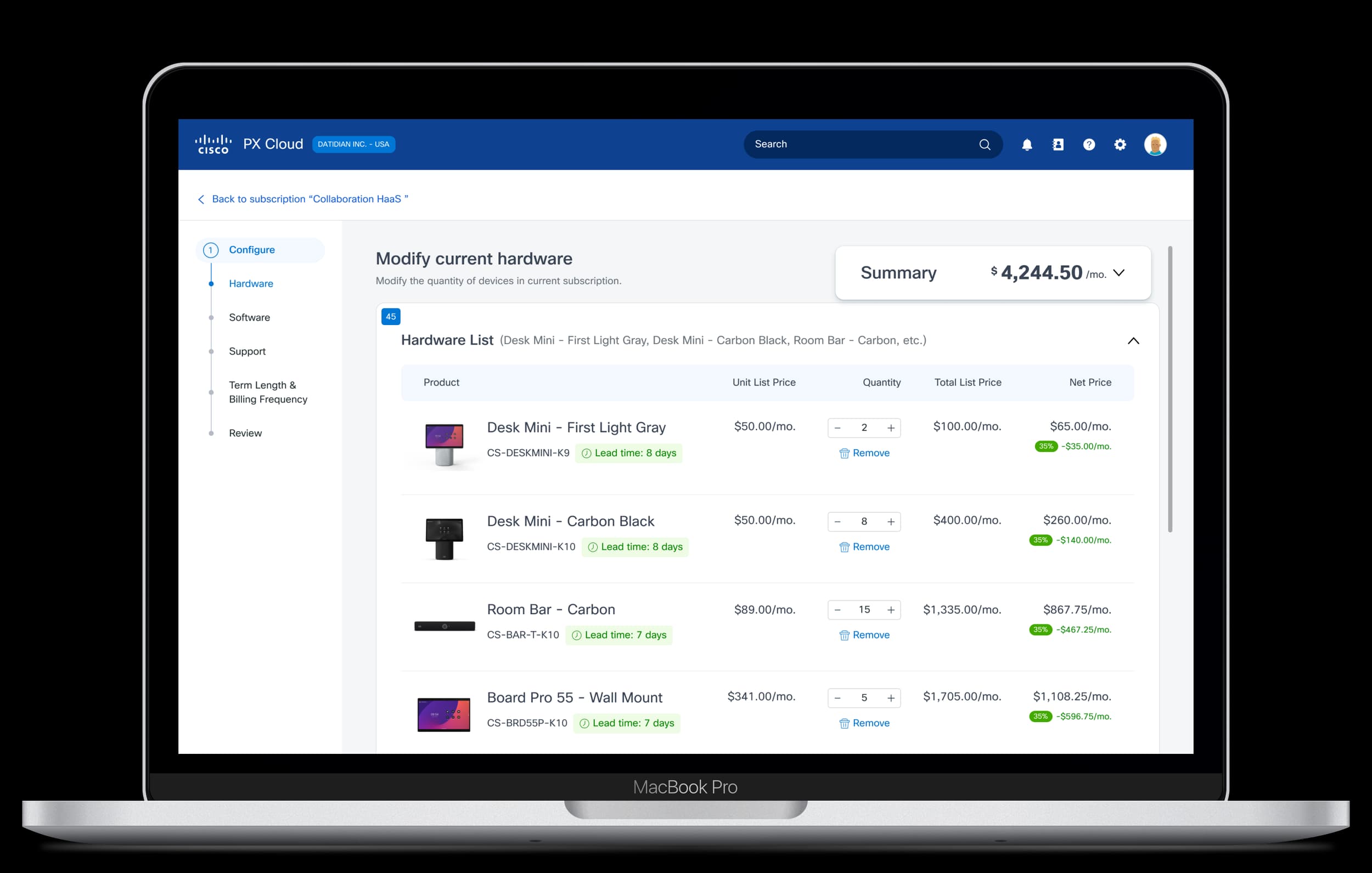
The Create Proposal flow was one of the most painful steps in the old CCW. Mapping it to real API objects clarified exactly where the design had to flex and where it could stay simple. The result was a single guided flow that replaced a maze of manual steps.
With technical feasibility confirmed, we could sequence the build with confidence. The prioritization matrix below ordered the work by partner value and delivery effort, giving the product team a defensible roadmap grounded in evidence rather than internal politics.
The Outcome: Before and After
The platform we designed was guided by one north star: a unified, seamless commerce experience, guided, personalized, and data-driven, that efficiently scales to meet the business needs of partners, customers, and Cisco simultaneously.
The contrast with the starting point was stark. What had been fragmented across a dozen disconnected applications became a single guided platform. The new experience delivered four things the old system simply couldn't: simplified flows that reduced cognitive load, unified navigation that made information findable, real-time collaboration between partners and Cisco teams, and AI-assisted recommendations based on deal context and history.
What had required partners to assemble their own picture from scattered data became a contextual, intelligent experience that surfaced the right information at the right moment. One platform, one view, everything a partner needs.
What I Learned
The map is the message. The ecosystem diagram did more strategic work than any prototype I made. Getting the whole system visible, in one room, at one time, created alignment that months of tactical work hadn't. Never underestimate the artifact that shows people what they already know but haven't been able to see.
Pause is a strategy. Stepping back wasn't a delay. It was the move that made everything else possible. In complex enterprise projects, the pressure to execute is constant. Resisting it long enough to understand the real problem is a skill worth cultivating.
Guide people through complexity, don't simplify it away. Partners weren't struggling because the work was hard. They were struggling because the system gave them no support. Designing guidance into complex flows rather than hiding the complexity respects users and actually works.
Technical POC builds trust. Turning a vision into something tangible, even rough, unlocks executive confidence, developer engagement, and team momentum. Ship something real as early as you can.