When Your Own Employees Call It “Terrible”
How a data-driven redesign turned Docusign's internal AI tool from an abandoned utility into a platform people actually wanted to use.
Role
Lead Experience Designer
Daily new chats
+27%
Active users
+16%
Custom assistants on platform
+150%
When Employees Call It Terrible
Docusign had built an internal AI tool called AskGPT. Employees had access to it. They just didn't want to use it.
The signal was impossible to ignore. An analysis of nearly 400 comments from a Glint employee survey surfaced a consistent, damning pattern. Users called AskGPT 1.0 “clunky,” “slow,” and “terrible.” Many were simply opting for consumer tools like ChatGPT instead. For a company publicly committed to customer-first experiences, this was a credibility problem as much as a product problem.
A heuristic evaluation confirmed what the survey implied. Four critical failures were holding the product back:
- Brand non-compliance. The interface didn't look like Docusign. Colors, typography, and components diverged from the established INK Design System, and that disconnect quietly communicates this isn't a real product.
- Blank canvas syndrome. The home screen offered nothing to start with. No templates, no prompt suggestions, no orientation. Just an empty input field and the implicit expectation that users would figure it out.
- Hidden management flows. Creating, editing, and sharing custom AI assistants (one of AskGPT's most powerful capabilities) was buried in a narrow side panel few users ever found.
- No feedback loop. Users had no way to flag bad outputs or rate responses. Every interaction was a one-way street with no mechanism for improvement or trust-building.
Design Philosophy: Aesthetics as Function
Before a single wireframe was drawn, the team aligned on a shared belief: functionality is the foundation, and aesthetics are the multiplier.
AskGPT 1.0 had failed the trust test. Its unpolished appearance led users to assume the underlying AI was equally unpolished: buggy, unreliable, not worth their time. So we treated every visual decision as a trust signal. Using Docusign's official INK Design System wasn't just a branding requirement. It was a way of telling employees: this tool is secure, compliant, and built to the same standard as everything else Docusign ships.
Because the team built on INK throughout, every aesthetic choice was simultaneously an accessibility decision. WCAG AA and AAA compliance wasn't audited at the end. It was baked into the foundation.
Exploration: Back to Basics
We resisted the temptation to start at high fidelity. Instead, the process opened with drawing boards, competitive analysis, trend research, and sketches: the kind of low-stakes exploration that lets ideas compete before any one of them gets the weight of a polished mockup. For the highest-stakes flows, we developed two or three distinct options and brought them into collaborative review sessions with engineering, catching feasibility issues before they became expensive surprises.
Three Transformations
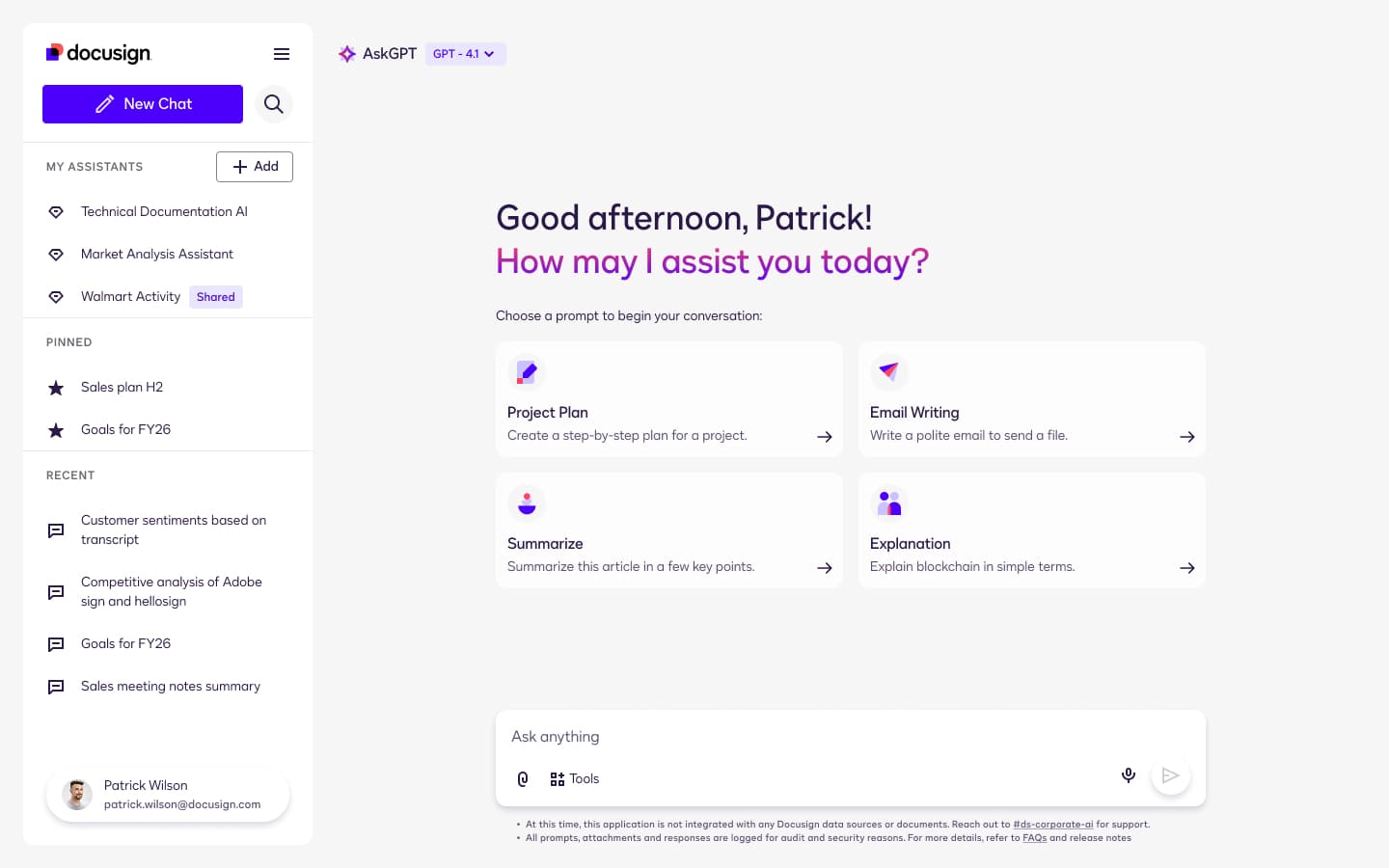
A homepage that gives people a place to start. The previous home screen offered nothing. We replaced that blank canvas with a structured dashboard built around two things users needed most: where they've been and where to begin. A persistent left-hand navigation made chat history and custom assistants immediately discoverable. Four prompt cards (Project Plan, Email Writing, Summarize, Explanation) gave every user an immediate starting point regardless of their experience with AI tools.
Assistant management that doesn't hide the power. The side panel approach for managing custom AI assistants was replaced with a dedicated full-page view. Assistants are now clearly divided into Created by me and Shared with me, each represented with descriptive cards that make capabilities browsable. A feature previously invisible to most users became a first-class part of the experience, and that visibility change alone had measurable downstream impact on adoption.
A creation flow with a live preview. Building a custom AI assistant is genuinely complex. We solved this with a single powerful addition: a live preview panel on the right side of the screen. As users build their assistant, they can test it immediately, prompting it, seeing how it responds, adjusting instructions in real time before ever saving. This collapsed the gap between building and validating, and dramatically lowered the barrier to entry for users who'd previously found the creation flow too opaque to bother with.
QA as a Design Responsibility
After high-fidelity prototypes were locked, the design team didn't hand off and disappear. We ran a rigorous QA phase alongside engineering, performing detailed design-versus-development comparisons to catch discrepancies in spacing, interaction behavior, and visual polish before they shipped. Our direct involvement ensured the coded product matched the design not just structurally, but in the ways that build or break user trust: the weight of a shadow, the timing of a transition, the alignment of a label.
Usability Testing: 13 Users, 7 Departments
We made a deliberate choice: participants would evaluate a functional development build, not a static prototype. Testing on real code meant findings reflected real behavior: load times, interaction states, edge cases. Not an idealized simulation.
Between September 12 and 19, 2025, we ran thirteen moderated 1-on-1 sessions over Zoom. Participants came from seven departments (Product, People, Engineering, Sales, Finance, Growth, and DTS), ensuring the findings reflected the diverse needs of a company-wide audience. Users described the redesign as a “significant leap forward.” One director, asked to rate the improvement on a 5-point scale, gave it a 6.
We treated that enthusiasm as a starting point, not a finish line. The research also surfaced specific, quantified issues that needed attention before we could call it done.
A Data-Driven Roadmap
After testing, we counted exactly how many participants encountered each issue and used that data to assign impact rationale to each potential improvement. This turned subjective feedback into a defensible prioritization framework anyone on the team could stand behind.
The roadmap organized into three phases: immediate fixes (settings visibility, prompt clarity, input edit/redo, visual QA), mid-term (citations and source links, Google Workspace file support, quick-action refinement), and long-term (agentic AI connecting AskGPT to Slack and Jira, folder organization, org-wide assistant sharing). Each phase was sequenced by the intersection of user impact, business value, and engineering complexity. Not gut feeling, not stakeholder preference.
What Shipped, and What It Did
AskGPT 2.0 launched on September 23, 2025. Comparing daily averages from one month before launch to one month after, the numbers told a clear story.
The custom assistant numbers tell the most interesting part. The feature existed in AskGPT 1.0. Nobody was using it. The redesign didn't change what the feature could do. It changed whether users could find it, understand it, and trust themselves to try it. That's the work design does.
What I Learned
Employee-facing products deserve the same rigor as customer-facing ones. Internal tools are easy to deprioritize. There's no competitive churn, and users can't leave. But disengaged employees don't just avoid bad tools; they form opinions about the organization's competence based on them. The bar matters.
Aesthetics are a trust mechanism, not a luxury. The jump from AskGPT 1.0 to 2.0 wasn't primarily functional. The underlying AI capabilities barely changed. What changed was how the product felt. That feeling drove the 27% increase in new chats. Visual quality is not a post-functional concern. It is a functional concern.
Blank canvases block beginners. Every user who landed on the old AskGPT homepage and left without prompting wasn't lazy. They were unguided. Start states are a design responsibility, and giving people a place to begin is as important as building the feature they're supposed to use.
Quantify qualitative findings before prioritizing anything. “Users struggled with settings” is an observation. “8 out of 13 users couldn't find Advanced Settings” is a data point. The difference determines whether a fix makes it into the next sprint or disappears into the backlog.
QA is part of design, not the handoff after it. The gap between a polished prototype and a shipped product can quietly undo months of work. Staying involved through build isn't process overhead. It's quality control over the thing users actually experience.